The Loader Appearance Tab contains settings that appear directly on the Loader and do not interfere with the Fields section.
Here is a list of the settings available in the Appearance Tab:
| Name | Description |
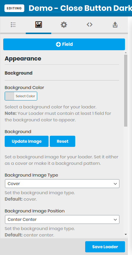
| Background Color | Set the background color of the Loader (supports opacity) |
| Background Image | Set a background image for the Loader. This works in combination with the Background Color in case your image is transparent. |
| Background Image Type | Set the background image whether it will appear as a cover, repeat mode, repeat x only or repeat y only. |
| Background Image Position | Set the position of the background image (Left Top, Left Center, Left Bottom, Right Top, Right Center, Right Bottom, Center Top, Center Center or Center Bottom) |
| Background Color Overlay | Select a color for your loader’s overlay. |
| Loader Content Position | Set the position of the Fields in your Loader (Top Left, Top, Top Right, Center Left, Center, Center Right, Bottom Left, Bottom or Bottom Right). |
| Side by Side Loader Items | Makes the Fields in the Loader appear side by side instead of one below another. Please note that this setting does not work will all Loader Content Positions. |
| Display Close Button [PRO] | Enable to display a close button on your Loader. |
| Display Transition [PRO] | Enable to set a transition for your Loader. The transition runs after the Loader finishes loading. |
| Disable Page Scroll | Set whether the page scroll will appear while the Loader is showing. |
Appearance Tab Preview: